Purple Floyd
Some brand names simply dictate their logo‘s theme – ‘Prisma’ for example. So as an act of rebellion, we’ve made it two-tone.
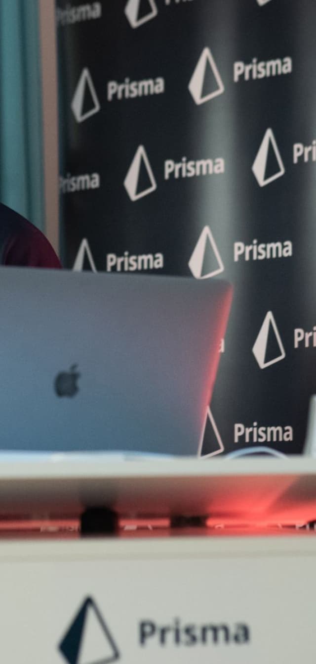
Prisma and Overnice go way back – back to when the deep-tech startup was still called Graphcool and before their pre-seed round was successfully raised. When they rebranded to Prisma, we were tasked with creating the new logo.
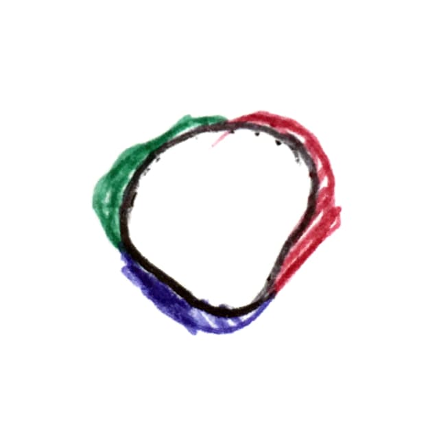
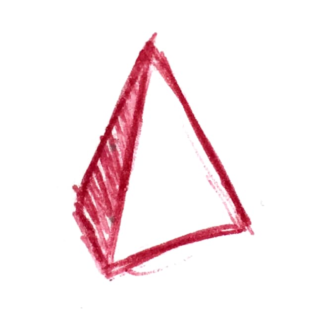
Using a pyramid was not as straightforward as it might seem. The symbol seemed too preoccupied by Pink Floyd’s iconic Dark Side of the Moon record. But many scribbles and experiments later, it became clear that it’s the most interesting shape and the association is more of a feature than a bug.
Aligning databases and the code accessing them is essentially what Prisma does. The light-transforming powers of a prism are a great analogy for that. Still, we wanted to create a symbol that would be expressive and recognizable even in black and white. Any sort of rainbow was off the table.
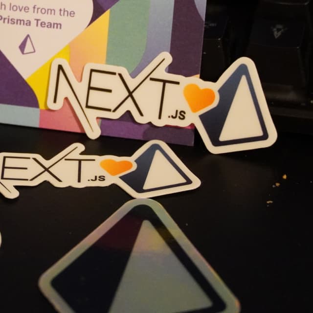
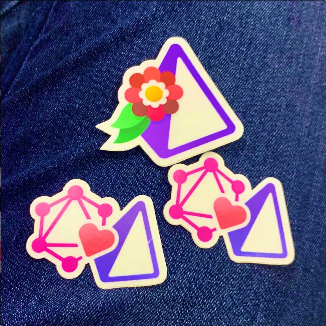
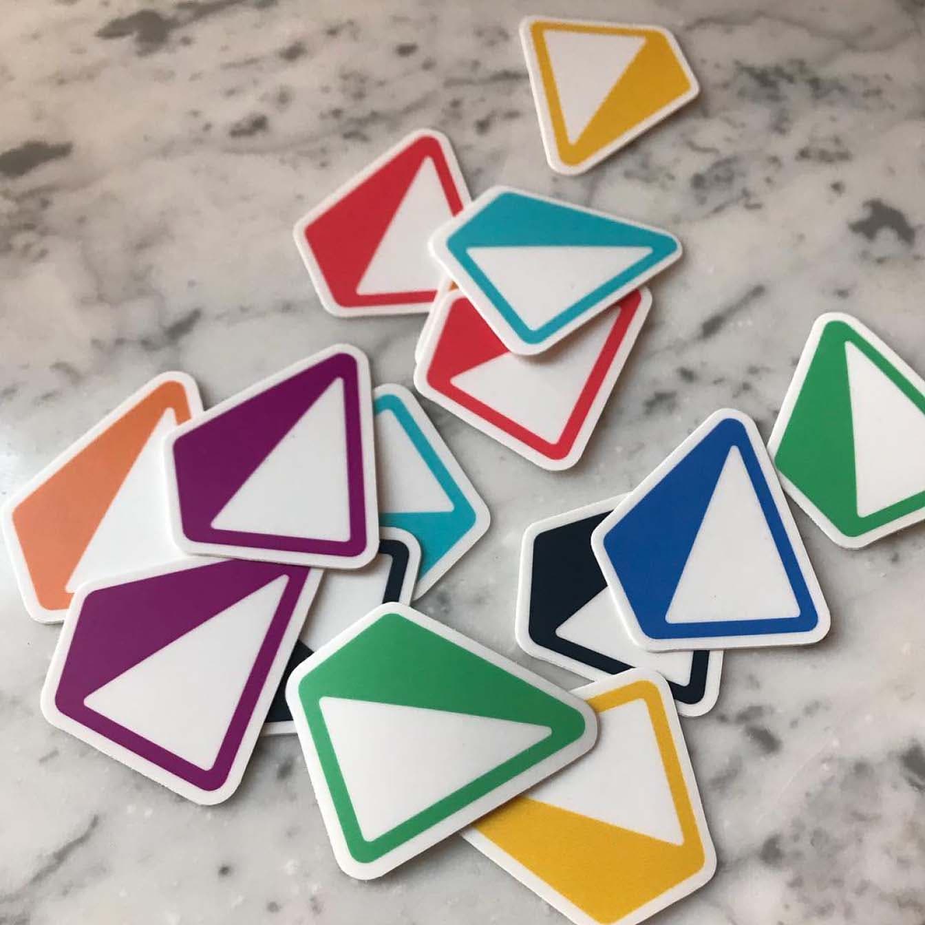
Strangely coming back to Pink Floyd, the light and dark side of the prism did the trick of creating a dynamic, outstanding and versatile icon. It can take any color, be augmented with gimmicks and stand on its own without the need to spell out the brand’s name. Always standing on a solid base while dynamically pointing up.
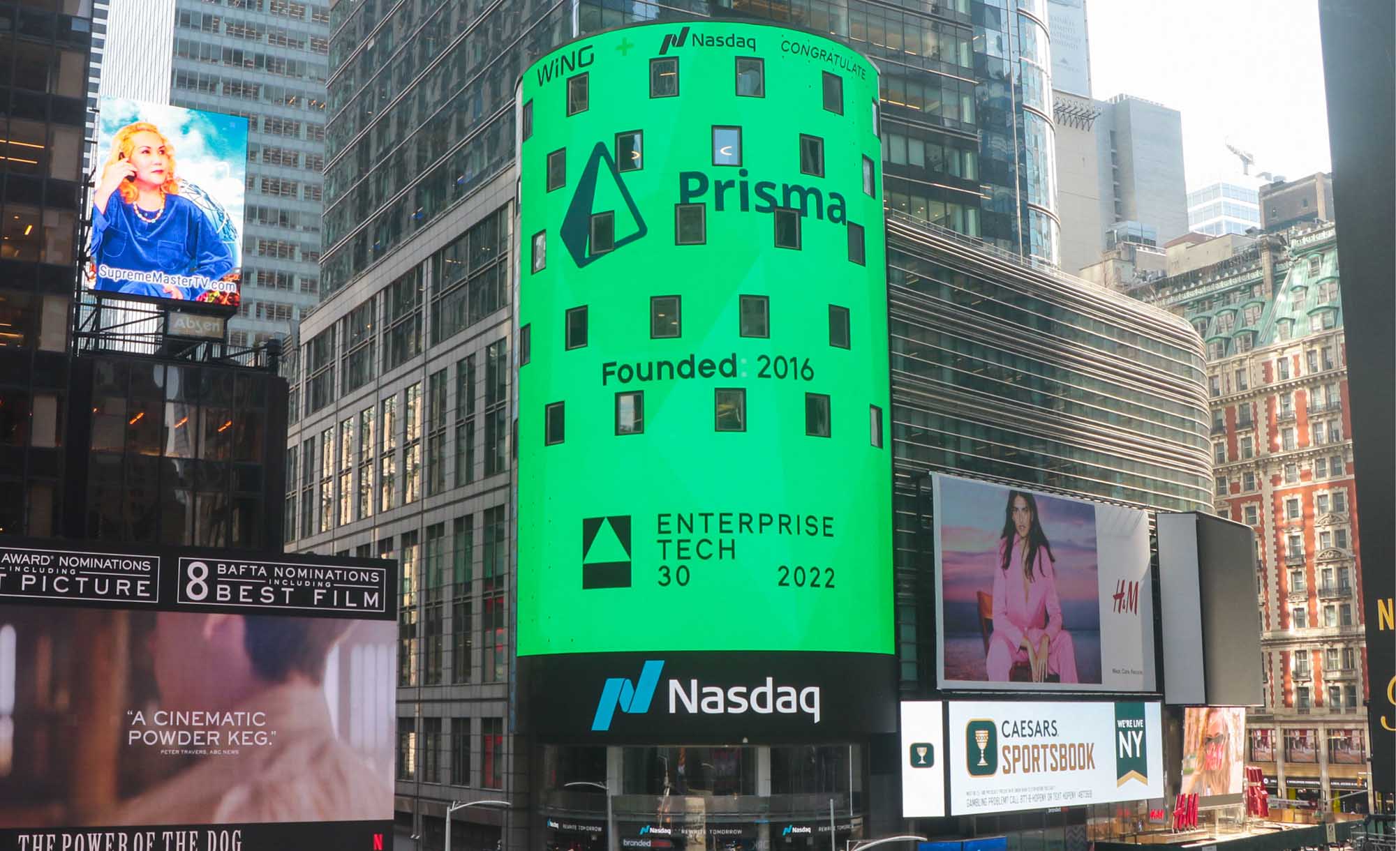
Finding the right proportions and dimensions of the pyramid proved crucial for the final result. As it’s often the case with minimal, simple-looking logos, they tend to hide the complexity and consideration that went into making them. But we’re not complaining, it made it all the way to Times Square.


