To the (Github) Stars!
Build your base, customize your spaceships and embark on epic adventures. With the intergalactic Flightcontrol internal IT brand and platform.
We rarely start on a clean slate when creating branding. With “Flightcontrol” we not only got a name but a whole theme that came with it: the wonder of human flight, a trove of culture, associations and excitement. Nice, especially since hosting and internal IT aren’t very thrilling aspects of digital products.
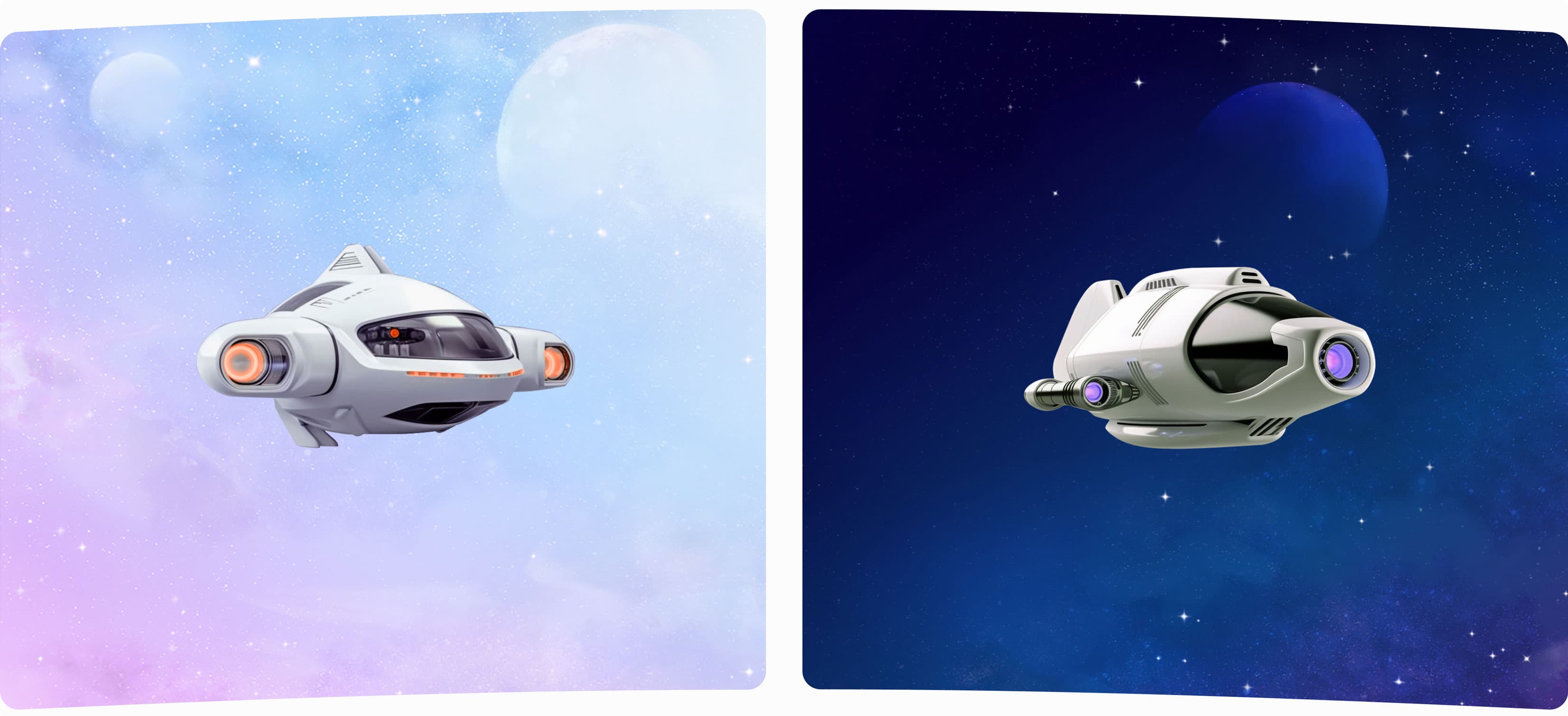
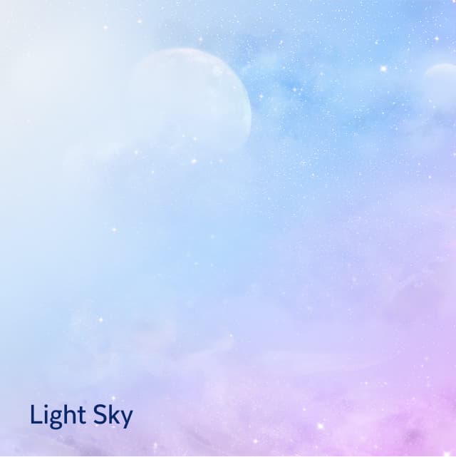
The very first step on our journey towards an intergalactic branding was nailing the theme. Exploring many angles, we found an optimistic, almost dreamy galaxy, full of cotton candy space skies and the tempting promise of adventure.
We were searching for a logo that would fit on the flank of a spaceship hull or the flag of an intergalactic entity. Exploring a bunch of ideas and concepts, nothing struck us as fitting as the slick combination of the letters F and C. Strong lines in a dynamic shape amount to a logo that can rally the whole galaxy behind it.
The hero of this world is the user: A spacepilot embarking on adventures in spaceships customized for every job: their projects in Flightcontrol. Their dashboards act as the safe and reliable space station, supporting them along their journey.
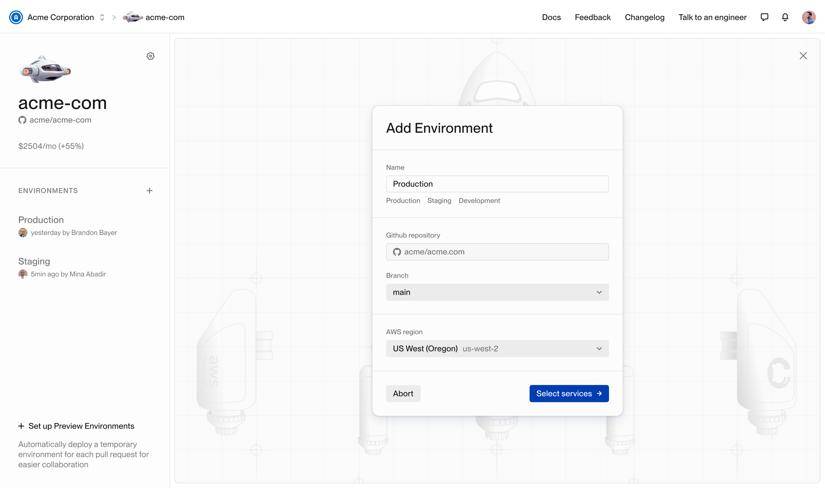
At the same time, we couldn’t go full sci-fi. Flightcontrol is a powerful B2B app providing the base layer for scaling-focused and ambitious projects. Our branding had to reflect that and strike a balance between party and business.
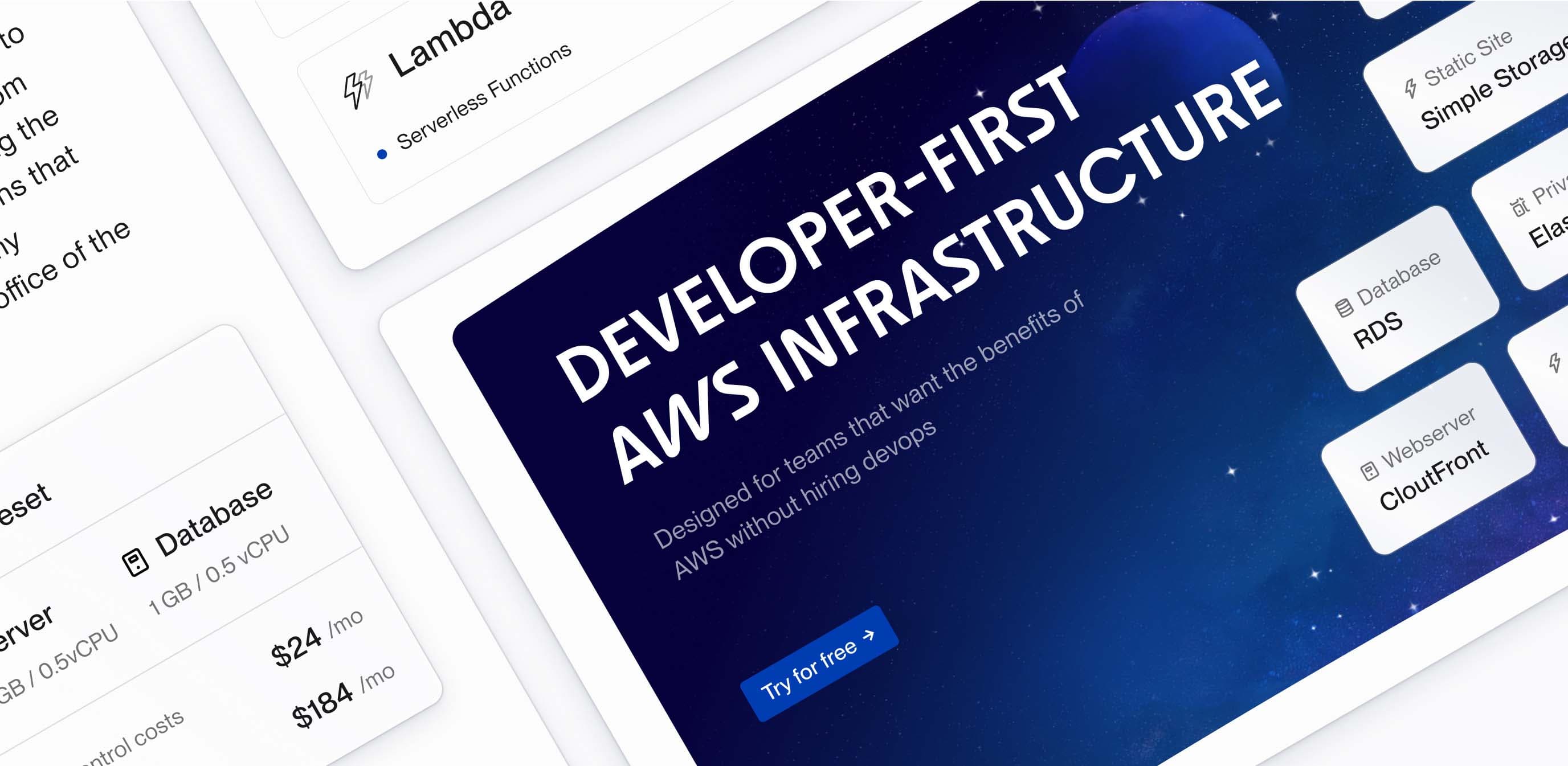
Applied where it matters: The FC product
A combination of illustrations and AI-generated spaceships against a backdrop of minimal, light and breathing UI did the trick. It’s branding that comes off strong at the initial touch-points before gallantly reducing itself when there’s work to do.
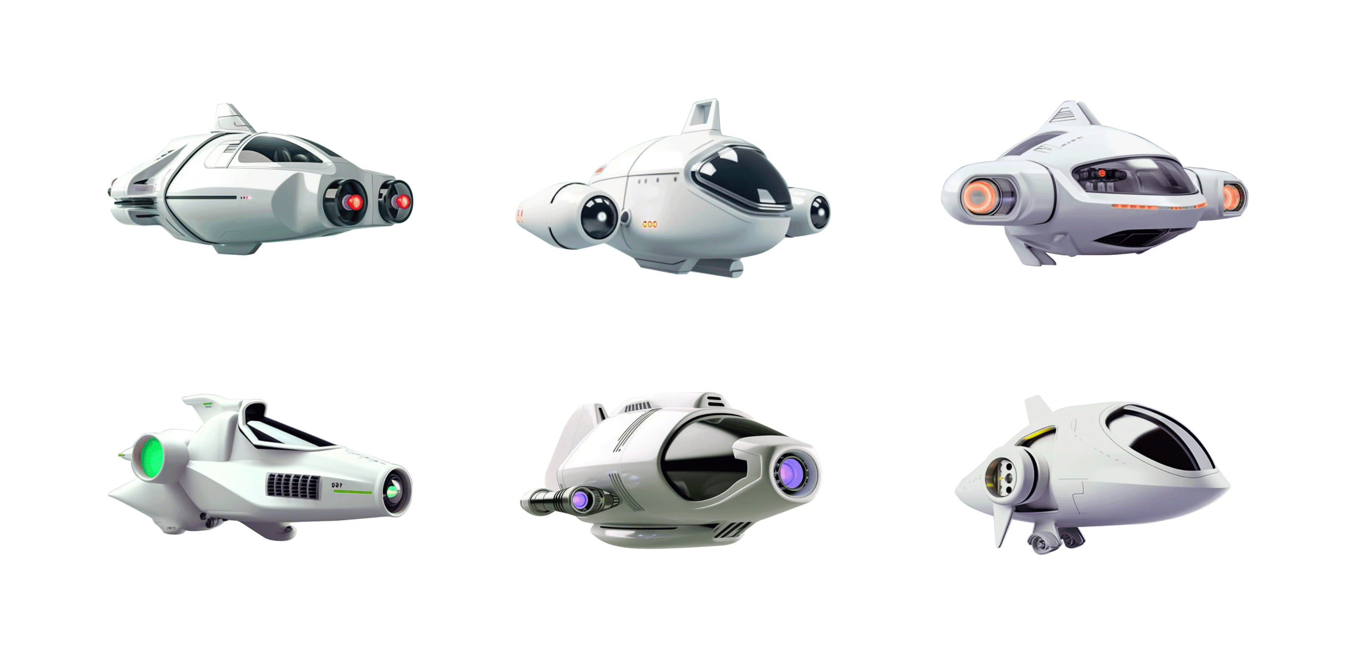
After finding the right prompt concept, including movie references, camera manufacturers and furniture design elements, the spaceships were created using Midjourney. Post production happened in Photoshop to edit color of the engine and accessorize the flying objects with branded logo stickers.
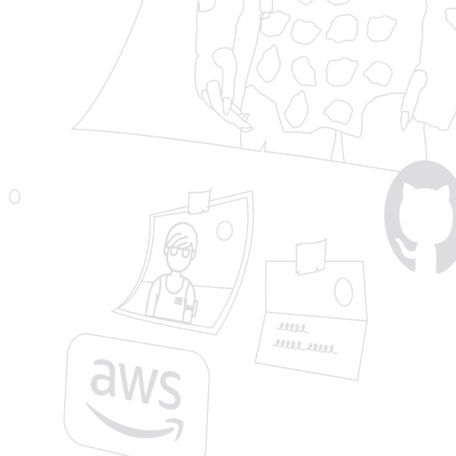
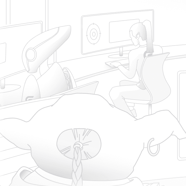
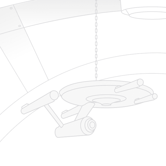
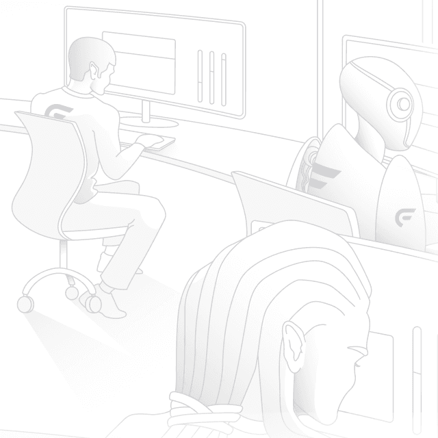
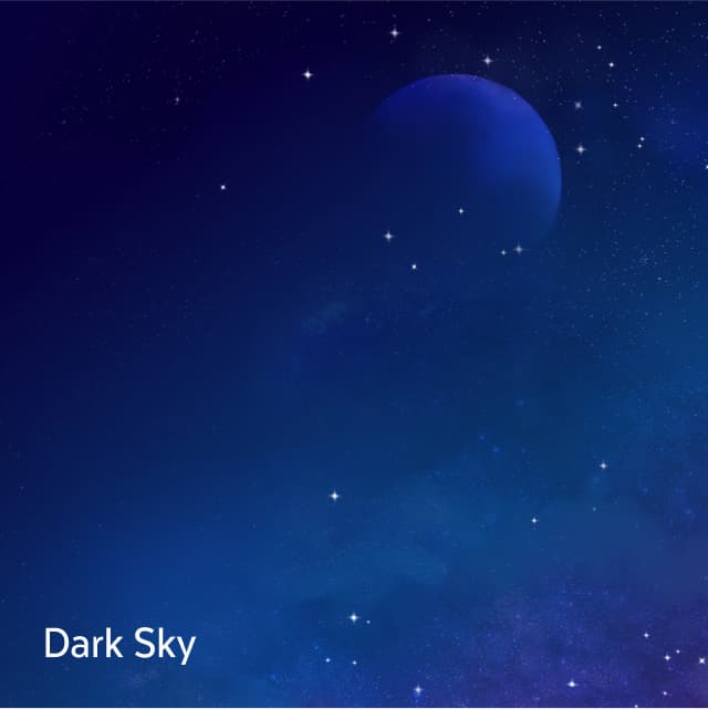
Metaphors are powerful tools to connect emotions with brands and products. To establish our sci-fi brand in the user’s mind, we’ve created hand-drawn illustrations, full of subtle details to serve as backgrounds for features and interface elements.
We’re generally huge fans of subtle references and were looking to further push the sci-fi narrative without overdoing it. This approach lead to the creation of a key visual: curved frames showing the dreamy space backgrounds, mimicking windows of a space base or ship.
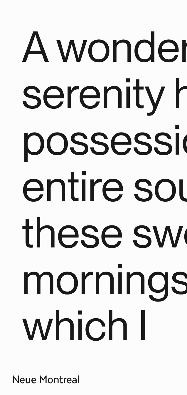
For headlines and bold marketing applications, we deploy ‘Youth’. The space-age-type font comes with bold cuts, rounded corners and could be used to label a whole fleet of spaceships. ‘Neue Montreal’ complements it as a straightforward display font, focused on readability.
The branding already features a variety of expressive styles. Icons and UI elements act as toned-down counterweights to the playfulness and focus on functionality. They’re inspired by navigation, wayfinding and cockpit controls.
With dreamy cotton candy space skies and AI-generated spaceships in the mix, we chose classic and grounded colors for Flightcontrol. A deep, rich space blue is the main color.
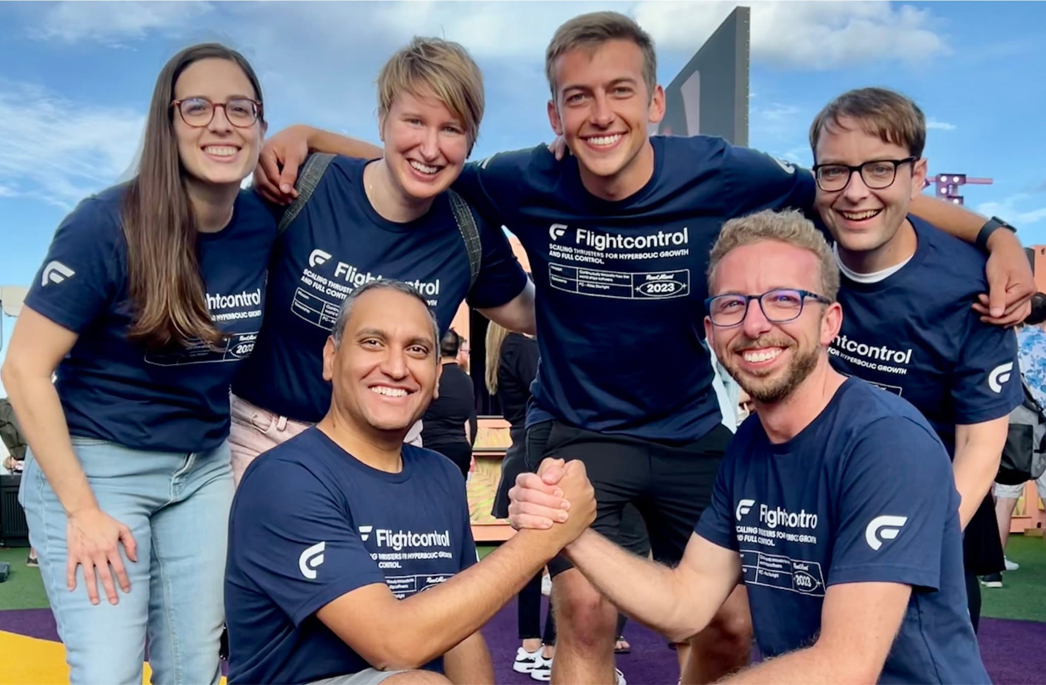
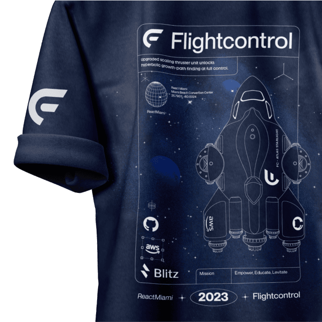
The flexibility of the space theme is simply amazing. It allows for almost unlimited styles without harming brand recognition. For example the T-shirt we created for the Miami React Conference ‘23. Combining brand elements with off-brand but fashionable line-styles created results that work great for clothing while maintaining recognisability.

