A Happy Place for Drugs
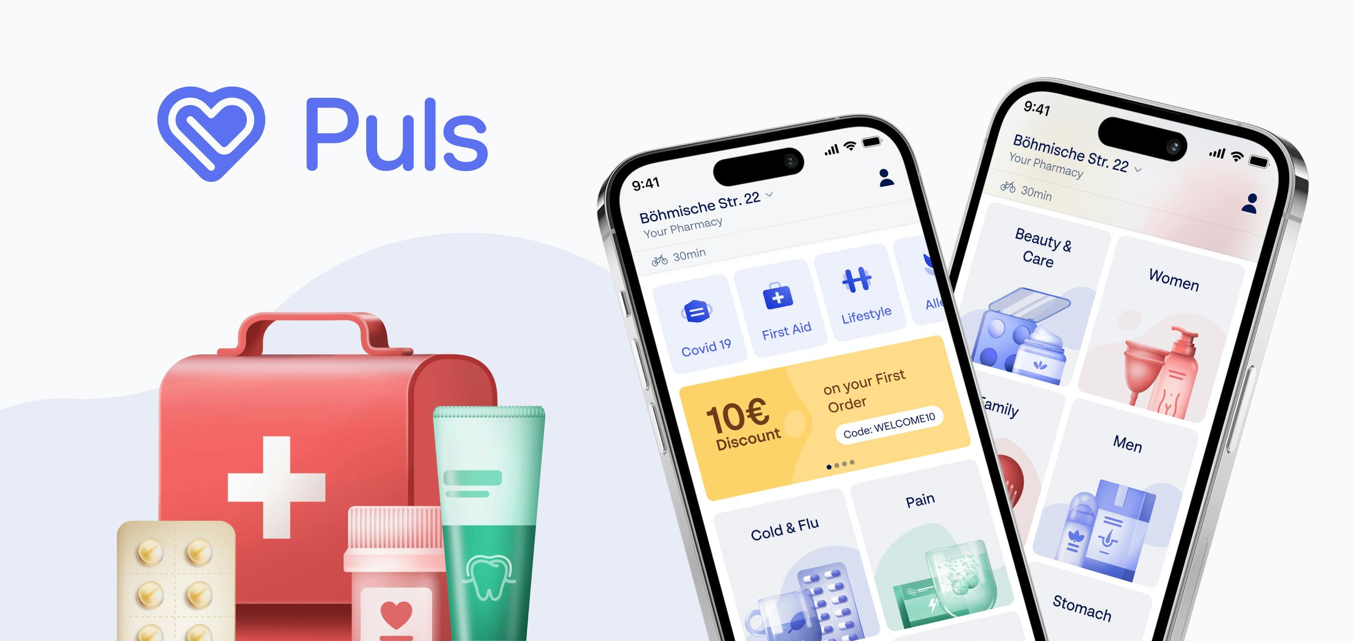
For GoPuls, we’ve created branding and a mobile app with a very demanding type of user in mind: someone suffering from migraine.
We were tasked to rebrand the medicine instant-delivery app First-A. Following our paradigm of treating brand and product as one, the app aims to radiate happy vibes while providing straightforward and competent help.
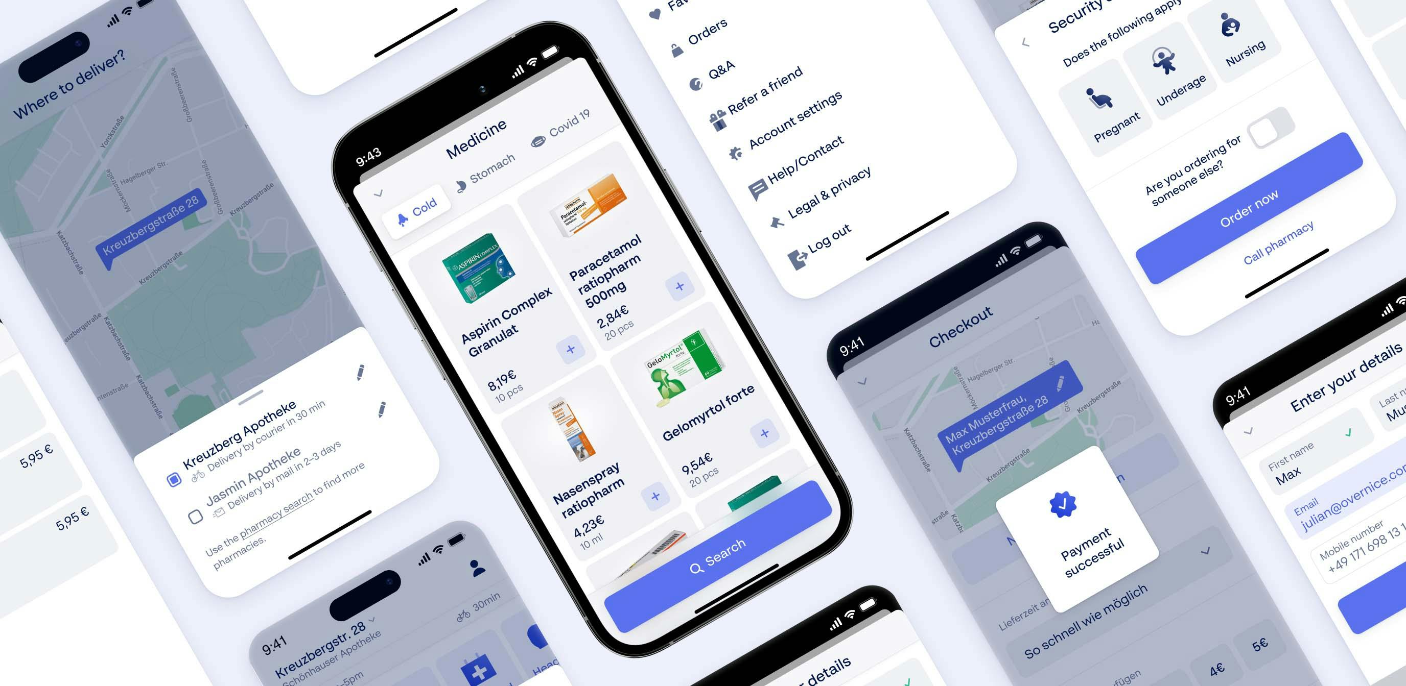
Good UX is always rooted in consideration for the user. Ours are quite special as they’re often suffering from a condition that requires medicine. Unobstructed and efficient navigation and a no-clutter information architecture were obligatory.


Healthcare comes with some color conventions. And although we love challenging the status quo, a saturated and calm blue, almost leaning to purple, was quickly identified as the main color. All accent colors follow the scheme.
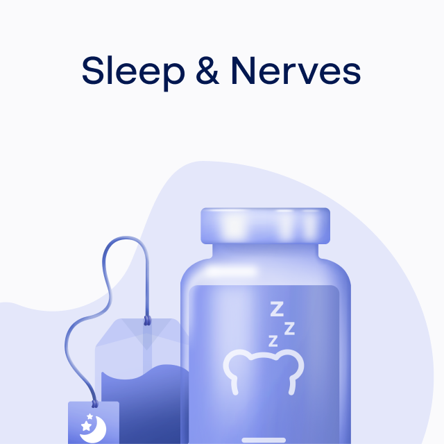
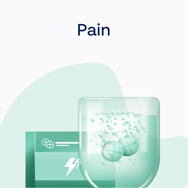
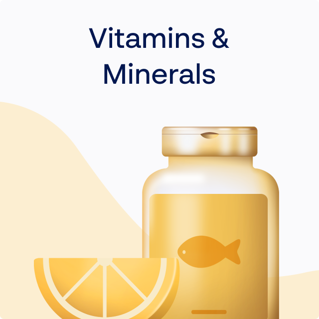
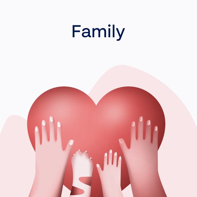
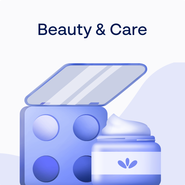
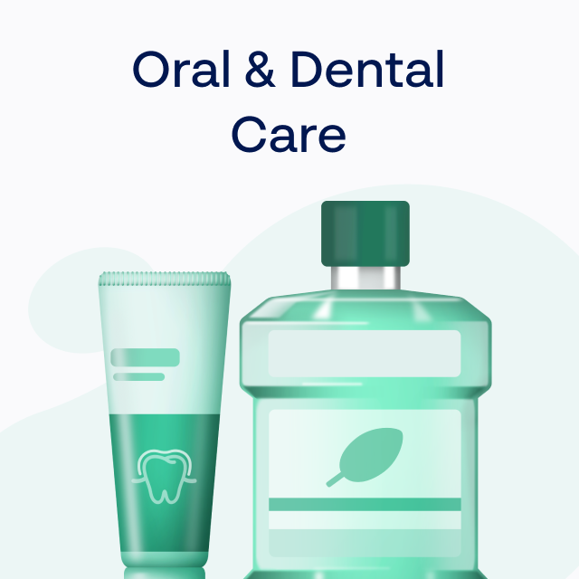
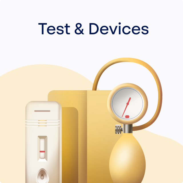

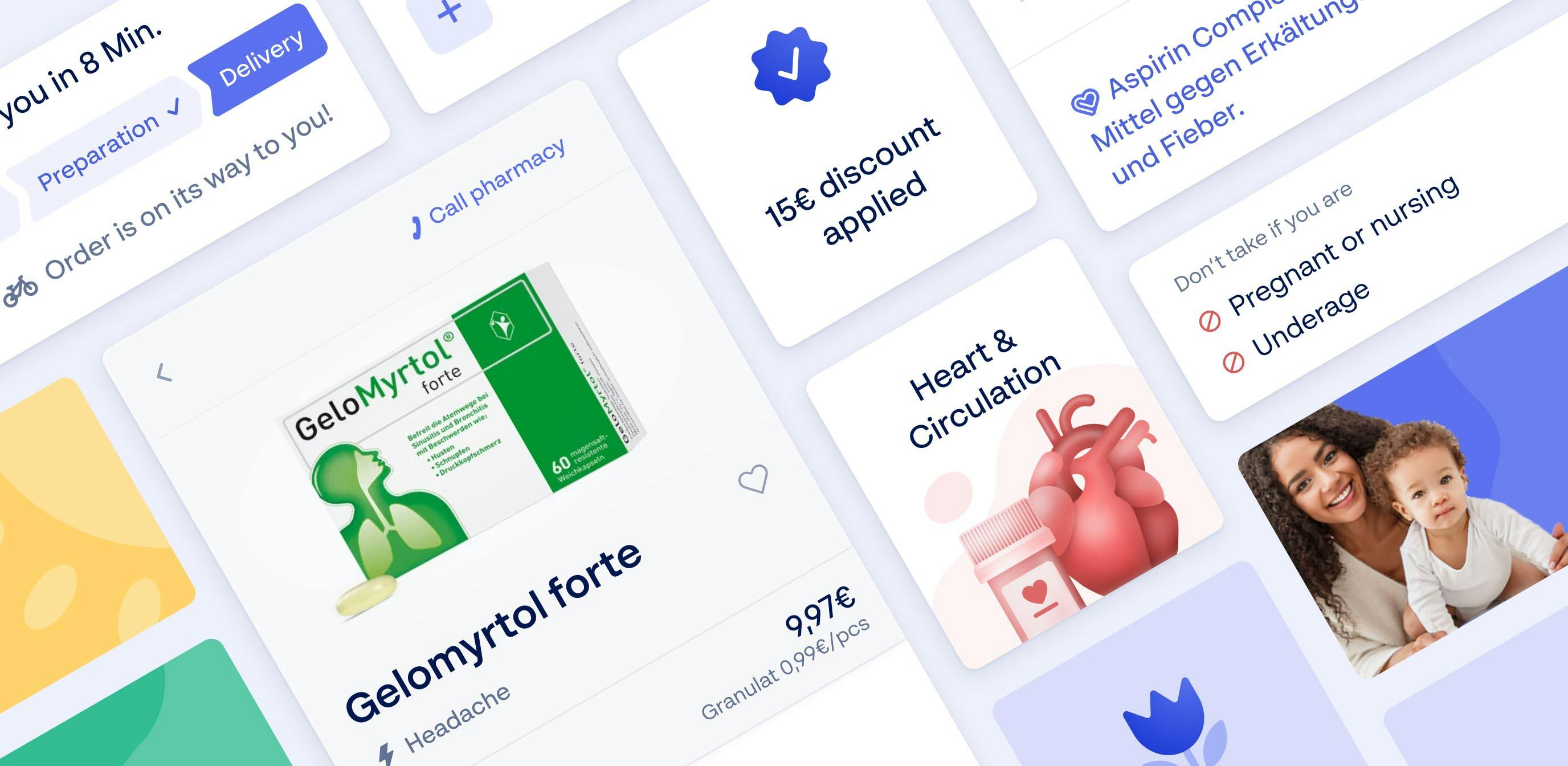
Big bold and hand-drawn illustrations make browsing and finding products fun. They’re a nifty trick to create an initially exciting experience that gradually toned-down as the user progresses away from the illustrations and towards actual drug packages.
We didn’t do their website. But Stellate’s
Even details, like informative icons, were handcrafted to add to the happy place that is the GoPuls app. Two levels of detail make sure they’re fitting the occasion.

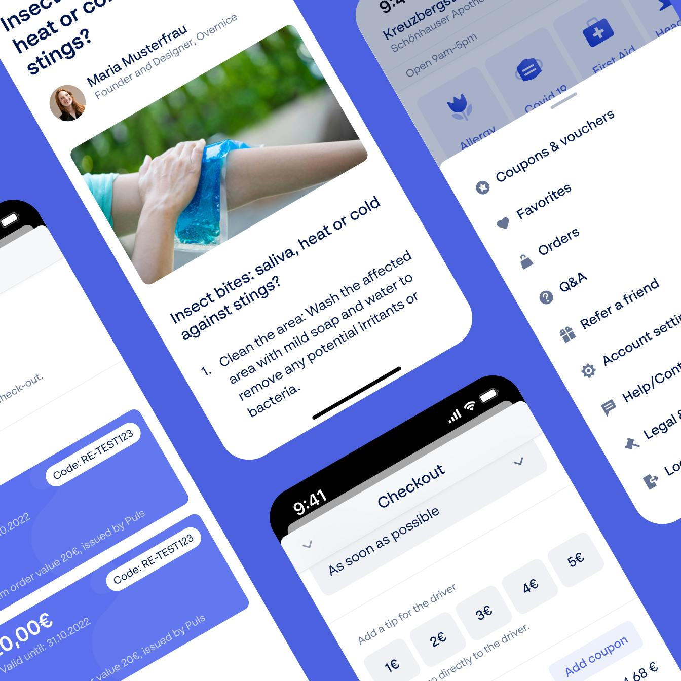

Researching fonts for the app, the most decisive question we asked ourselves was: “What would a user suffering from migraine want?”. Consequently, the BR Sonoma is used throughout the app as a straightforward and very readable sans serif-font.
